 One of the fantastic things about modern digital cameras and the high quality optics in lenses is the incredible detail possible in images. One of the rotten things about modern digital cameras and the high quality optics in lenses is the incredible detail you end up with in images. Something that may not be obvious about interacting with someone in person is that you tend to focus more on the whole person. A scar, a slight blemish, a (gasp!) pimple, any kind of flaw in the skin becomes less significant when people are talking and experiencing each other for real. All of those little imperfections that fade to gray in real life, the things that help make us who we are, jump out in blinding detail in a photographic image. Even the beautiful people aren't immune.
Of the handful of models I've worked with since getting serious again about photography, Ashley probably represents the most successful shoot up to this point. The whole thing happened right in her tiny little apartment and yet the resulting images show a nice range of looks, attitude and emotion. I keep going back to her pictures, playing, tweaking, digging deeper into what I can pull out of a particular image as a photographer and artist. After initially skipping this particular shot, I took another look and ended up spending most of an afternoon crafting it into the best finished result I could get.
I think something I have to learn is to be more patient both in shooting and in post production. This time around I got really patient, pulling out all the stops on the basic retouching, brightening up her eyes and then carefully going through a process I've been practicing that gives the skin a smooth, healthy glow. I've got a ways to go before I can match the pros in post production techniques, but I think I'm making headway.
 In my head I keep seeing some of my images in black and white, but haven't had much luck getting the result I'd like through the functions in photoshop. While working on this image I came to the conclusion that it's the channel mixer Stupid! Or at least in this case that's what it was. Although there's more than one way to do things in photoshop, it was converting the image to monochrome in the channel mixer and then tweaking the red, green and blue channels back and forth that gave me the tones and contrast I was looking for. Wanting viewers to really be pulled into how amazing Ashley's eyes look, I cropped in tighter and went horizontal with the framing to add tension against the verticle shape of her face. Was that the way to go? I'm still thinking about it. Would it be better back in the verticle framing? Maybe. Regardless, since putting this black and white version on my Flickr page, it's received more comments than any of my other images. There must be something about it that works.
 The knife image is another study in lighting, shape, composition and whether or not it works better in color or black and white. It's a shot I've been thinking about for months and quite frankly, I've been a little bit afraid of it. Why? Probably because I knew it was going to take a fair amount of time to set up and shoot and the end result was questionable. Being hungry for more quality work in my portfolio finally got me off my indecisive butt and starting the step by step process of constructing the image.
 The easy part was jamming the knife point into a scrap piece of 4x4 lumber and folding the handle over. The harder part was figuring out how I was going to light the silly thing. The main light source was a portable flash unit off to the right. A snoot funneled down a narrow beam that illuminated just the top part of the blade and handle and made the Gerber logo pop out. The bacground is a sheet of black foam board with another flash aimed at it. I figured with a knife like this the background color had to be dramatic. A red gel over the flash gave me the rich crimson I was looking for. The last touch was to hand hold an LED headlamp from the left to pop just a little light into the top edges of the knife and using a slow shutter speed to give the continuous source a chance to register. The flashes were fired with a CyberSync trigger and two receivers.
The imperfections that show up on a person's face? It happens with product shots too. Those little specks of dust just wouldn't go away no matter how much I brushed and blasted with compressed air. Some slight shifts in the texture of the metal also had to be dealt with. So I settled in for some serious retouching, did my usual contrast adjustment, the final digital sharpening and ended up with a finished image that's pretty darned close to what I originally had in mind.
 The conversion to black and white was a bit simpler than what I went through with the image of Ashley. Once again, is it better in color or black and white? I've had numerous compliments on the color version and I really do like the way it turned out. But there's something to be said for the rich tones of black and white too. I guess in the end it's all a matter of opinion.
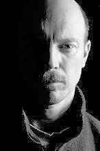
No comments:
Post a Comment